This case study documents the process of creating Stencil: a story of a UI sticker sheet that’s become the HR Design System allowing to deliver accessible, responsive, and consistent HR experiences for Amazonians used by over a hundred products.
Background
01
Before Stencil existed, when building my first application shipped by my team, we were using UI implemented in several existing products, provided in a form of a UI sticker sheet including a very few components and lacking guidelines. As our team expanded and more applications were in the pipeline within the new generation of the HR suite, it became obvious that we needed a design language not only to communicate with our users in a consistent way but also allowing us to collaborate, build, prototype and test products faster and at scale.
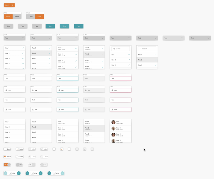
Stencil UI sticker sheet
My role
02
I started working at Amazon as a UX Design intern in January 2016 and got a permanent position six months later. The waters were deep straight away starting with a huge project: an end-to-end product within HR space. I spent over three years designing several end-to-end products and collaborated on many more.
In 2019 I moved to the freshly formed Stencil team including two designers. They did great job at taking the sticker sheet to a next level defining early foundations and guidelines. We delivered many new components and documented their usage. Shortly after joining, the team shrunk and as a designer with the longest tenure and knowledge of the genesis of Stencil and HR suite - I became the Design Lead.
In 2021, as Stencil was gaining recognition and the adoption increased rapidly, we hired a Senior Designer with passion for Product Management to lead the team to success.
Stencil today
03
Today, the Stencil Design System is a library of carefully crafted user interface components that are shared across products. The System has 410 components for both web and mobile applications. Each component consists of an encapsulated code package and a corresponding design tool asset. Stencil’s out-of-the-box support for accessibility, reusable React Web and React Native components allows designers and engineers to speak the same language, design, prototype and test with minimal technical support, all with the intent to implement solutions faster and reduce cost by minimising rework.
We are also proud of our an illustration library, UX writing guidelines, a research repository, Figma plugins and usage dashboard, alongside a contribution process and cross Amazon collaboration on direction and brand.
Mechanisms
03.1
Our mechanisms cover everything from sprint planning to drive concrete deadlines, track progress, and identify and reduce blockers/areas of churn, through task handling and prioritization, design and code library maintenance, releases strategy, hand-ins all the way to customer support, communication and knowledge sharing.

Figma design library change log
Process
03.2
Stencil design process consists of five stages:
Discover
A starting phase of every project where we gather and synthesise information to align with your team and stakeholders, define problem statement and scope work.
Define
We collect use cases, dive deep into available data, research industry standards and best practices as well as align with engineering in terms of feasibility.
Design
We ideate on concepts by asking How Might We (solve the defined problem(s) and communicate visually by telling user centric stories which we review often.
Deliver
We hand in signed off designs to engineering team for development, publish the artifact in Figma library and documentation on our portal.
Validate
We test our assumptions by A/B testing, usability study, click through studies and/or share-out sessions to make sure the problem is solved: if so, how and if not, why?
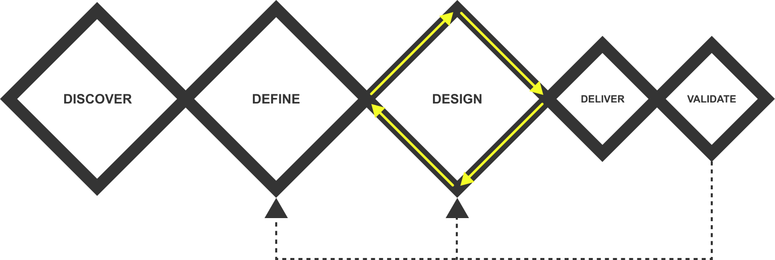
Stencil design process
Documentation
03.3
Our customer facing documentation defines the design, explains how to use the component/or pattern and includes guidelines on the usage, dos and don’ts, anatomy and behaviour of a given artefact as well as its variants, for example: primary, secondary, tertiary, disabled and destructive button. We also provide guidelines on responsiveness, accessibility and localisation.
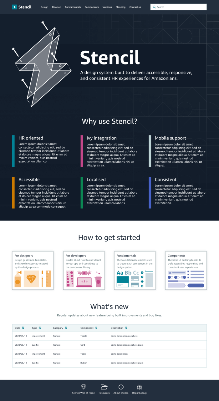
My new Stencil website design proposal
Foundations
03.4
The Stencil documentation covers its foundations in detail. We provide guidelines on:
- Visual Style describing shapes, lines and strokes and elevation;
- Colour including primary, secondary, tints and transparency usage;
- Layout covering spacing, grid and responsive techniques;
- Iconography usage and creation (for customer contribution);
- Illustration and Photography usage;
- Typography guidelines our responsive type-ramp, vertical rhythm, readability ensuring easy recognition of words, sentences, and paragraphs including font choice, font-size, kerning, tracking, line length, leading, and justification;
- Motion principles to enhance user interactions, improve usability, and create engaging and intuitive experiences across web and mobile platforms covering aspects such as user control over motion, avoiding distractions, ensuring accessibility for all users, and utilizing motion to convey information effectively;
- Internalisation and localisation guidelines on right-to-left languages and handling locale options;
- Accessibility ensuring delivering for all customers, regardless of their abilities in any given circumstance: situational, temporary, or long-lasting;
- Writing and content design covering voice and tone, grammar and structure, style and formatting, vocabulary and many more.
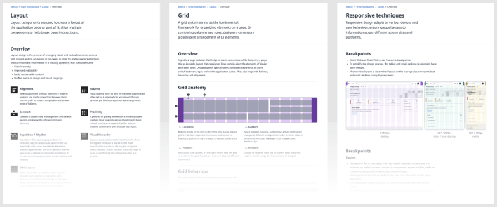
Stencil layout foundations
Components
03.5
All Stencil components and their variants are accessible and responsive and are shared with customers via our Figma library which is regularly maintained by our designers on call. They have built-in automated testing ensuring high quality performance and support wide-screens and right-to-left languages. We have recently started works on implementing design tokens allowing to express design decisions in a platform-agnostic way so that they can be shared across different disciplines, tools, and technologies.

Stencil button component
Patterns
03.6
We are working on adding new patterns to our library which currently include extensive guidelines on patterns such as button placement, error validation, interaction states, search and filtering.
My achievemetns
04
Sketch library
04.1
Pain-points
- Our old Sketch library was created by multiple designers resulting in many inconsistencies;
- Missing components variants and interaction states;
- Automatic library updates resulting in customers mockups breaking unexpectedly;
- Generally difficult to use.
My input
I rebuilt the library, firstly ensuring consistency between design and code. Secondly, the components have been to be interdependent so that any future changes can be done quickly and reflected in every component using an affected atom or style. The new library was being released together with code, giving full control to our customers on when they want to switch libraries rather than automatic updates. Please note, today we use Figma.
Layout, spacing, responsiveness
04.2
Pain-points
- The implementation of a responsive layout was the responsibility of product teams often resulting in products being inconsistent, not responsive and not accessible;
- At the time, 86% of Stencil components were responsive;
- Lacking guidelines on layout, app max width and dimensions of components.
My input
For the past year I have been working on Page Layout web component standardising use of the grid and aiding responsiveness, accessibility and consistency across all screen sizes, allowing products to design and build faster. I defined grids for various layout use cases including landing page, feed, SERP, document, workflow and form. I provided guidelines on spacing covering default and dense modes, reflow, breakpoints, max widths, text distribution, “above the fold”, full bleed components and created page demos for our customers to refer to. The engineering team is building a Page Layout component, a skeleton including components present in all products such as navigation and cover cases for pages with side panels and sidebars. Together with my fellow engineer, we built a Figma plug-in allowing designers to only design once for all devices. A designed page adapted its size and layout for various devices without having to design from scratch.
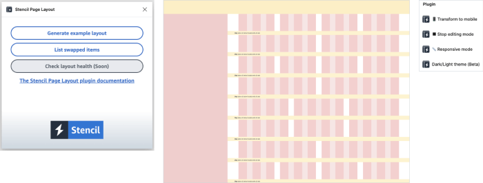
Stencil Layout Figma plug-in
React Native kit
04.3
Pain-points
- Our kit only covered web components and one of our main partners was planning on building a native app.
My input
I was responsible for designing multiple components to accelerate the development of native iOS and Android applications within HR space. One of our team tenets was to provide consistent UX despite of platforms hence it was required to balance pros and cons of native vs custom components. Today the kit consists of 45 accessible and responsive components.
Interaction states
04.4
Pain-points
- Our kit only covered web components and one of our main partners was planning on building a native app.
My input
Having design tokens coming soon, I provided guidelines on styles for each interaction state and audited entire component library in order to eliminate inconsistencies and ensure unified naming for components and their variants.
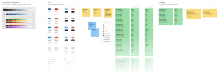
Interaction states tokens mapping
Design tokens
04.5
Pain-points
- Limited flexibility to make changes and scale;
- Better communication between design and engineering outlining detailed information about how to build user interfaces fast and reflecting design precisely;
- Lack of sufficient mechanism enabling contributing customers apply styles to components fast and without needing to reach out to us for support.
My input
I have provided tokens structure and outlined extensive guidelines on how to create tokens in a consistent way for our team to implement.

Design token proposal
Inverted colour scheme
04.6
Pain-points
- Components could not be used on dark backgrounds due to insufficient contrast ratio;
- Lack of mapping between colours used in components placed on light vs dark background in order to automate the default vs inverted colour swapping.
My input
Once our interaction states were neat and tidy, I mapped the corresponding colours ensuring sufficient contrast ratio in all cases.
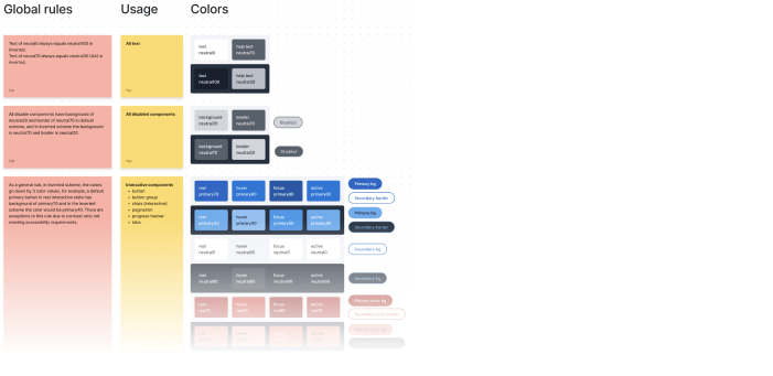
Colour mapping for automated colour swapping
Components & patterns
04.7
During my time at Stencil, I have designed and shipped multiple React Web and React Native components and patterns including search box and how results are filtered, error handling covering form validations, full page errors and error inline messaging, tables with expandable rows and optimised for large data sets, customer satisfaction surveys and how and when they are being displayed, carousel, date pickers, progress trackers just to name a few. I’ve maintained the library ensuring its health and streamlined usage for our customers.
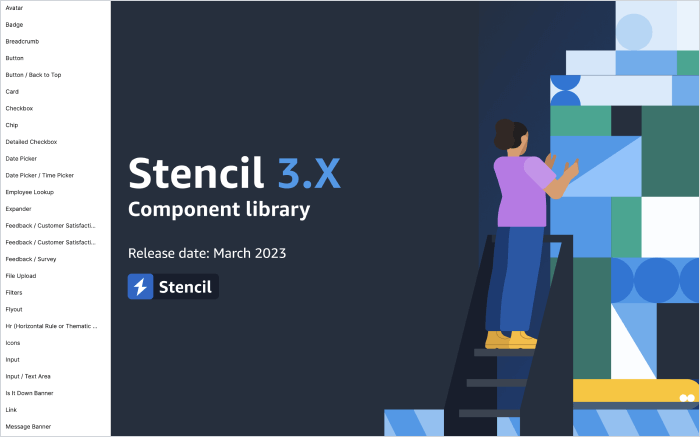
Stencil Figma web library cover
There's more...
05
Thank you for looking at this case study. I’d love to tell you more about key learnings, mistakes we’ve made along the way and my ideas for improvements. Looking forward to hearing from you.
Thank you, Aga